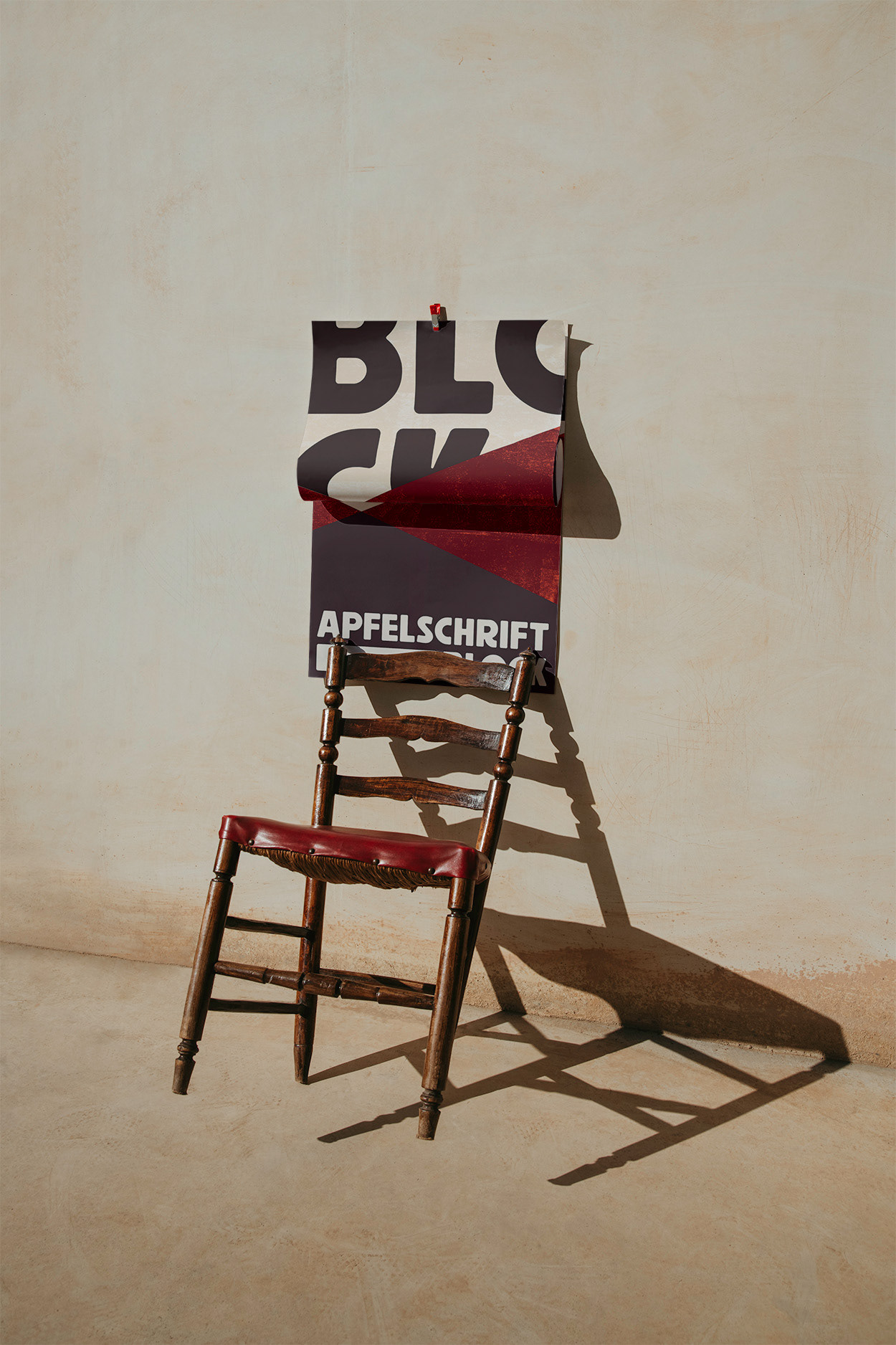
Apfelschrift Block
TYPEFACE DESIGN
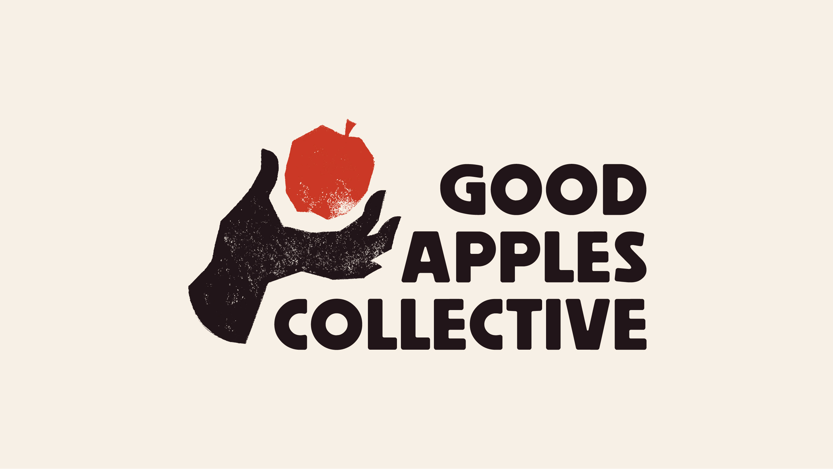
While designing a brand for the Good Apples Collective, I struggled to find a typeface that fit the singular energy of the organization.
Stumped, I finally decided that such a new and unique theater experiment required a new and unique typeface; I would just have to make it myself.
Both an expression of the client's ethos and a love letter to early 20th century German advertising, Apfelschrift Block turned out to be the perfect complement to the Good Apples Collective brand.

Inspiration
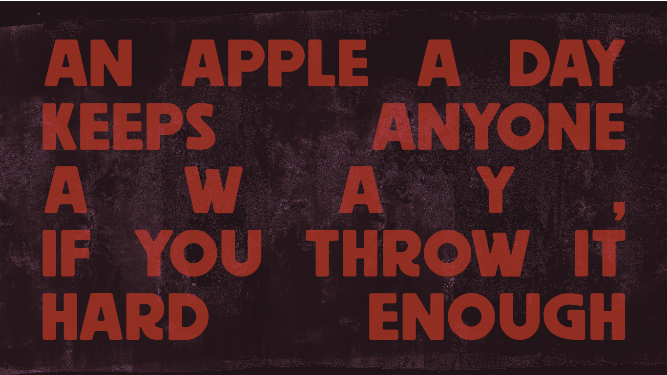
Inspired by the type used throughout German pre-war advertising, the typeface focused on punchy, highly legible letterforms while keeping the handcrafted feeling of a grotesque typeface.

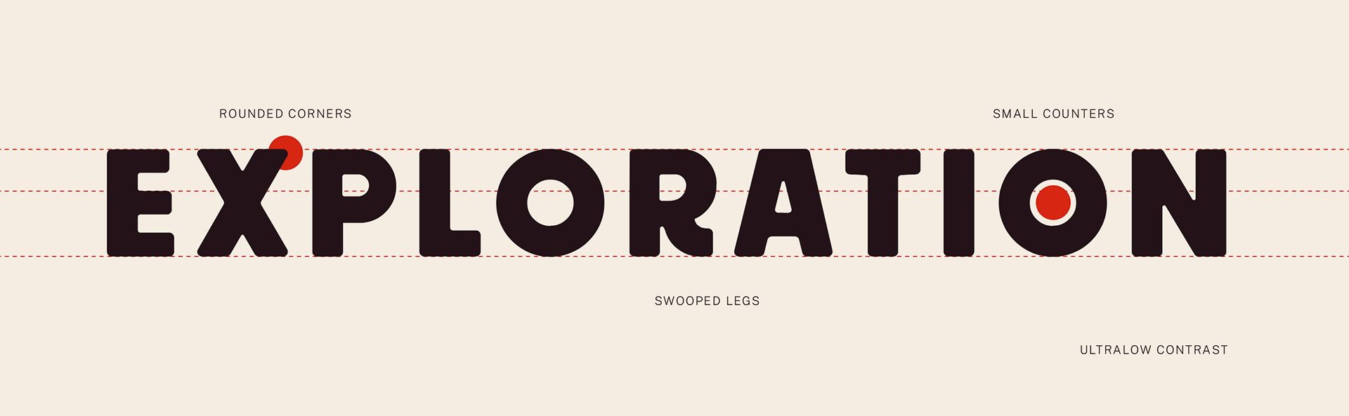
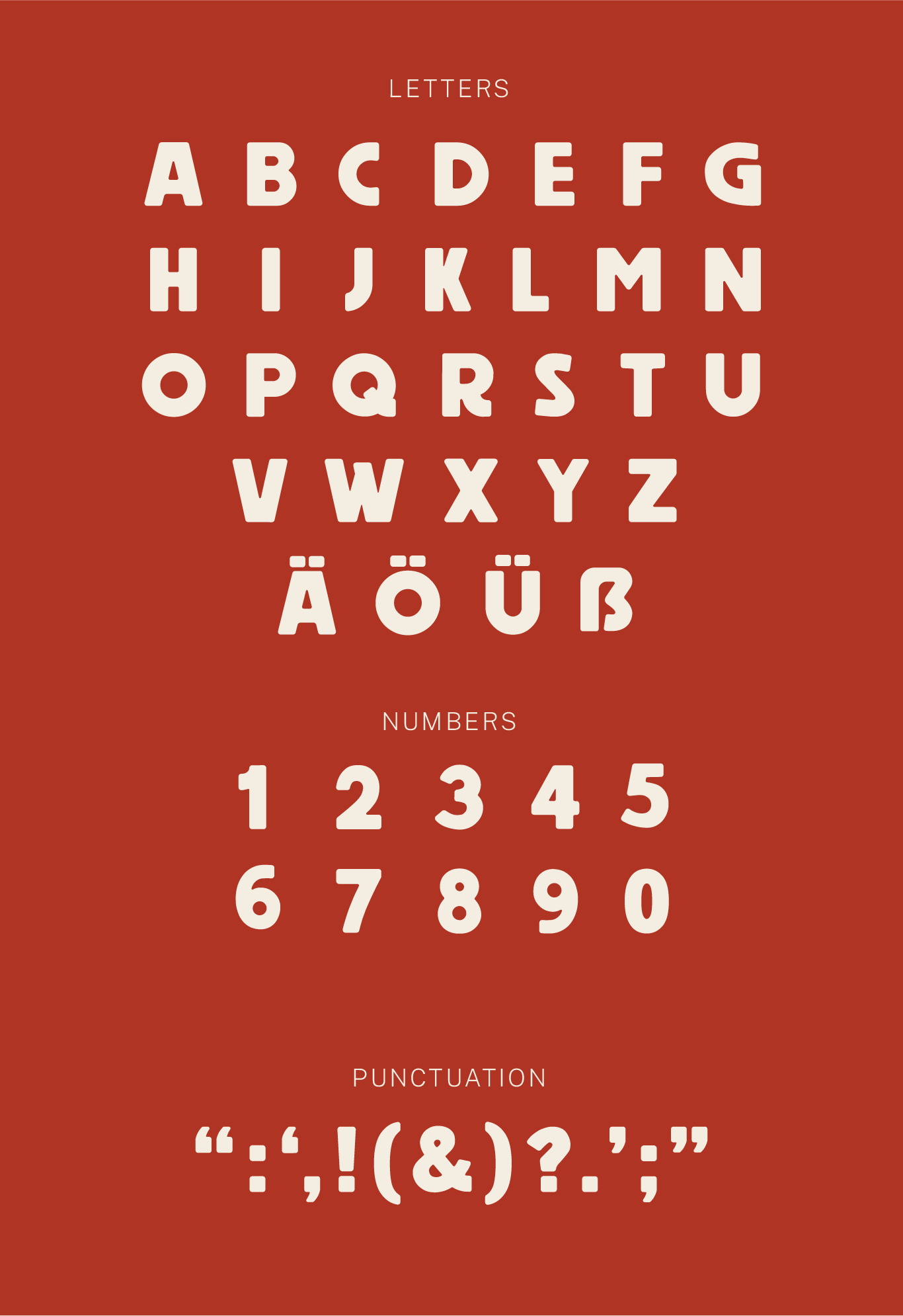
Letterforms
Simplicity and visual impact guided the design of the letterforms. Initially including only Latin capitals, I decided to pay respect to the typeface’s inspirations and later expanded the glyph set to contain all German capitals, including the modern capital Eszett.


Want to see how it all came together for the Good Apples Collective?