Good Apples Collective
BRANDING
OVERVIEW
A new theater company needed a brand to stand out in a crowed New York City theater scene. The organization was founded to provide opportunities for and collaboration between young artists and so developing the brand required a hands-on approach that emphasized the dedication and tactility of the group's work.
ROLE
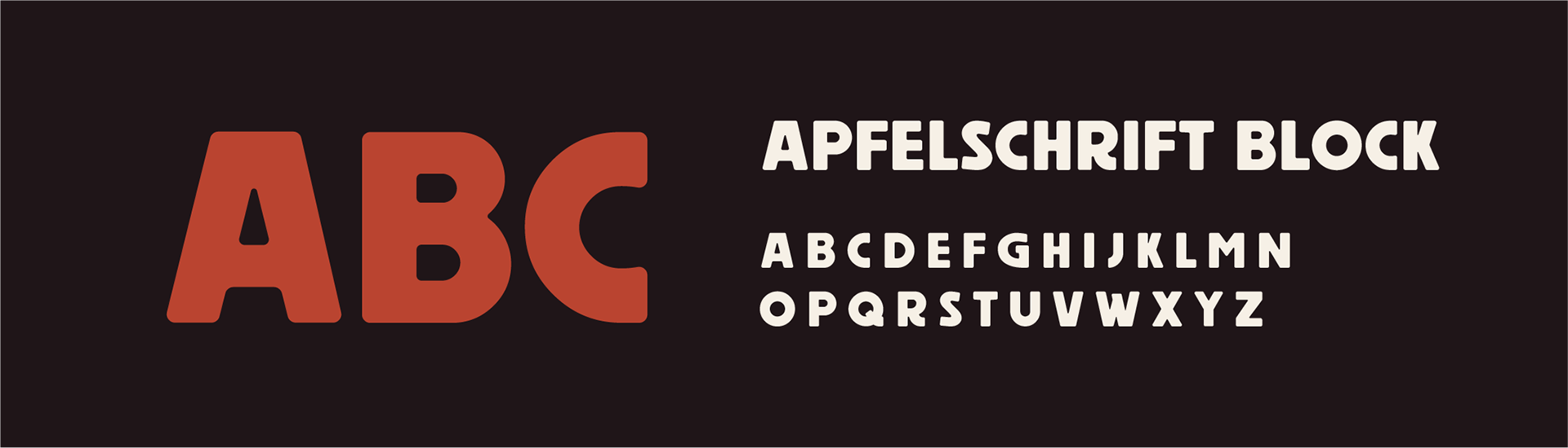
I conducted a branding workshop with the client and developed a brand which reflected the organization's personality and goals. I also played the role of typographer and developed a custom typeface for the brand (see the link at the end for more).
OUTCOME
Together with the client, I created a brand that spoke to the Good Apples Collective's mission and provided a striking visual language to support the group's growth and development.
Branding
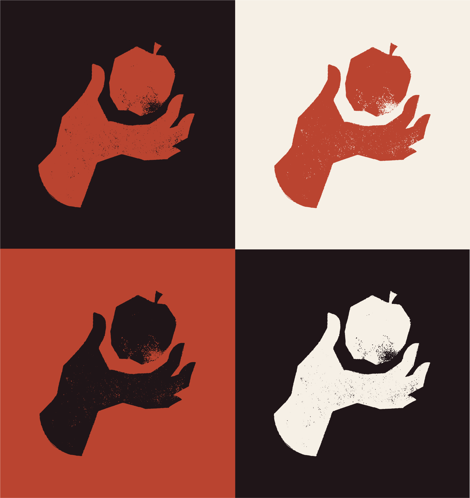
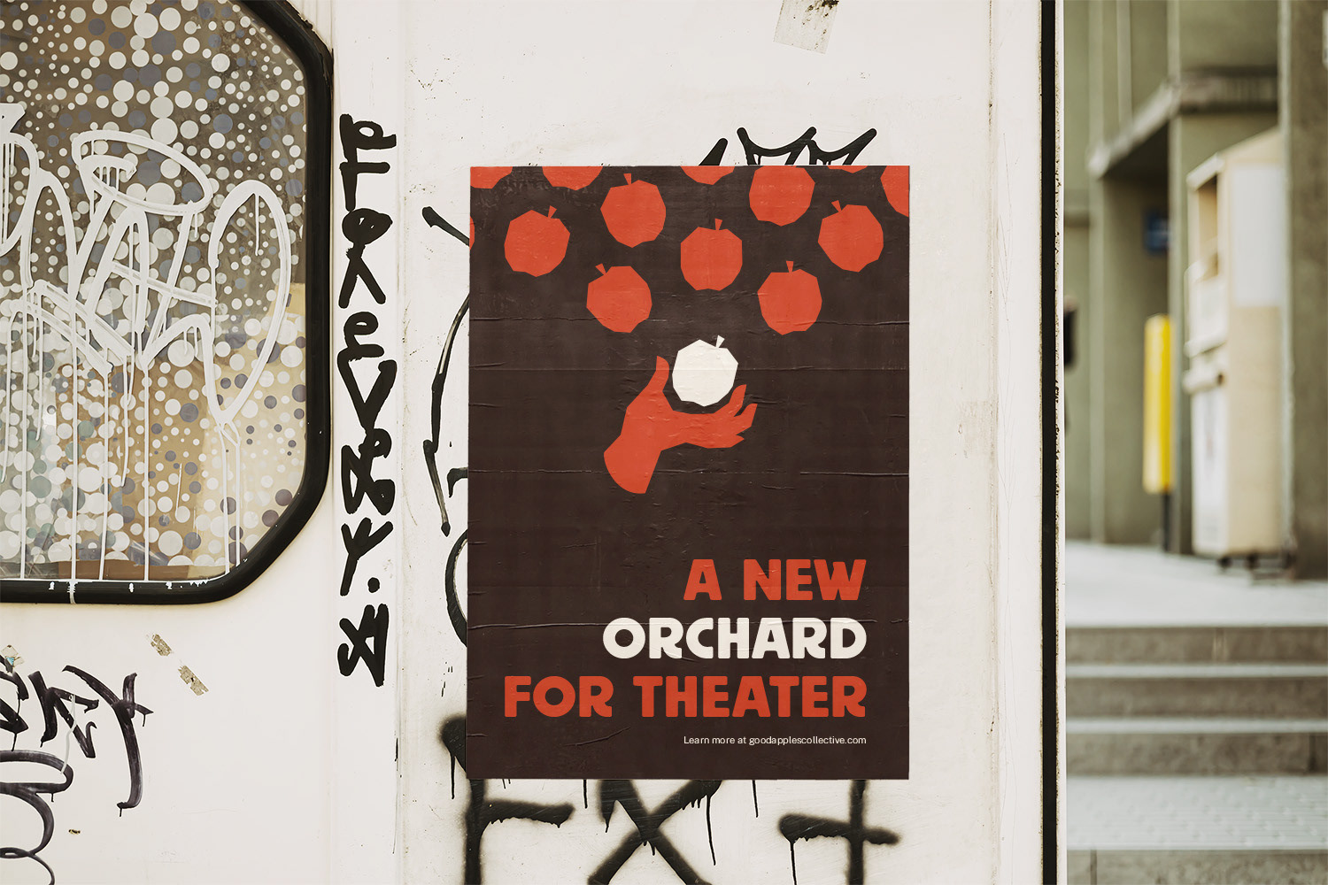
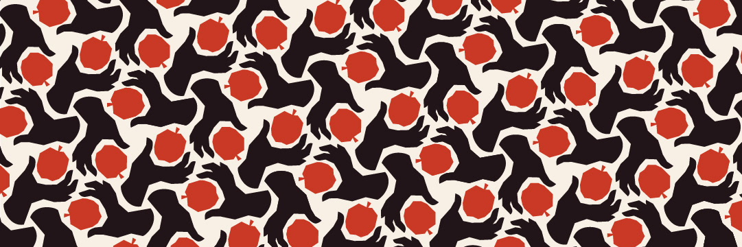
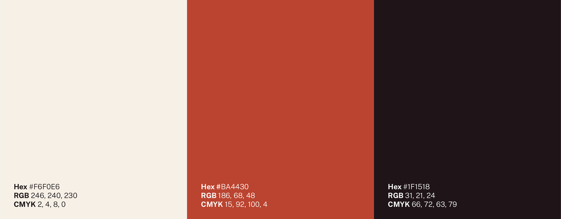
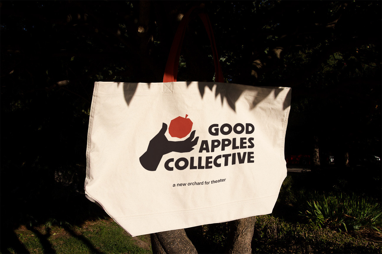
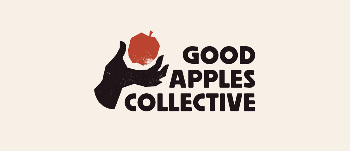
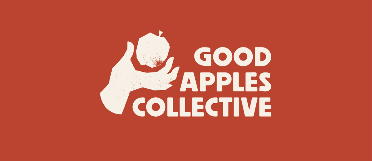
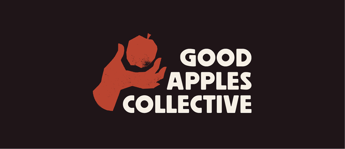
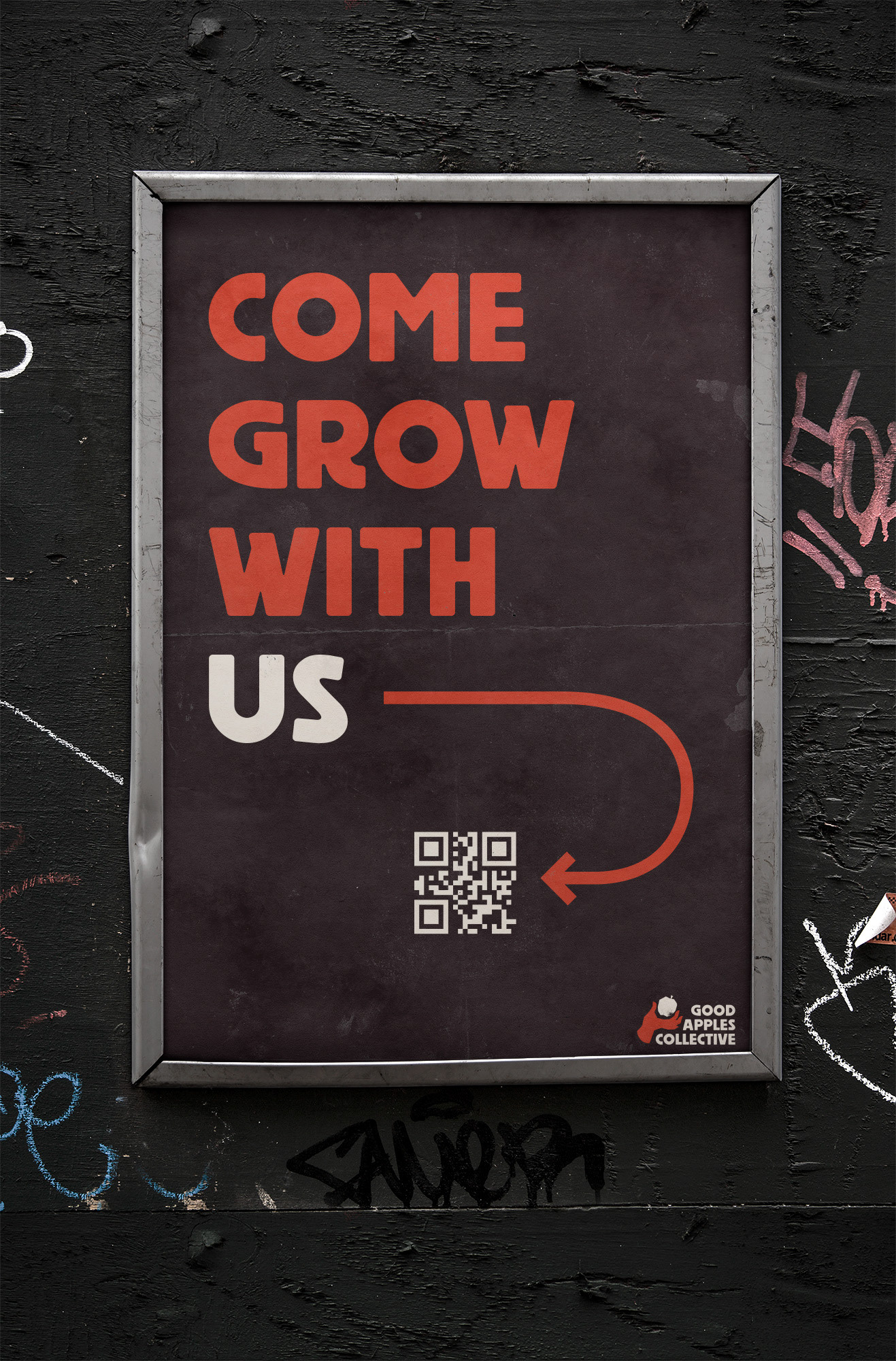
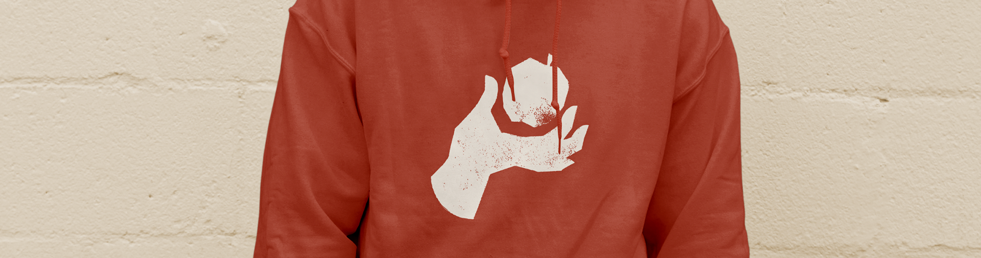
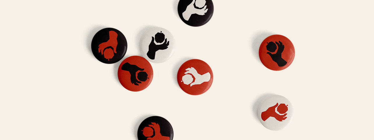
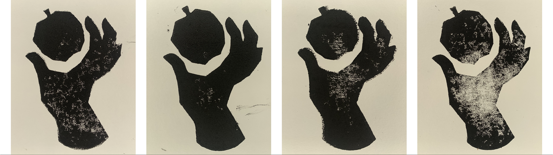
Inspired by the visual language of activism, brought to life by handmade elements and custom typography, the Good Apples Collective branding speaks to the transformative work of the organization. The brand's central mark conveys the feeling of striving from something new, just around the corner. The typography was developed to give the group's messaging the bold edge that their work embodies. These elements are then set in a color palette which feels naturalistic and approachable, while retaining the punch needed to stand out.

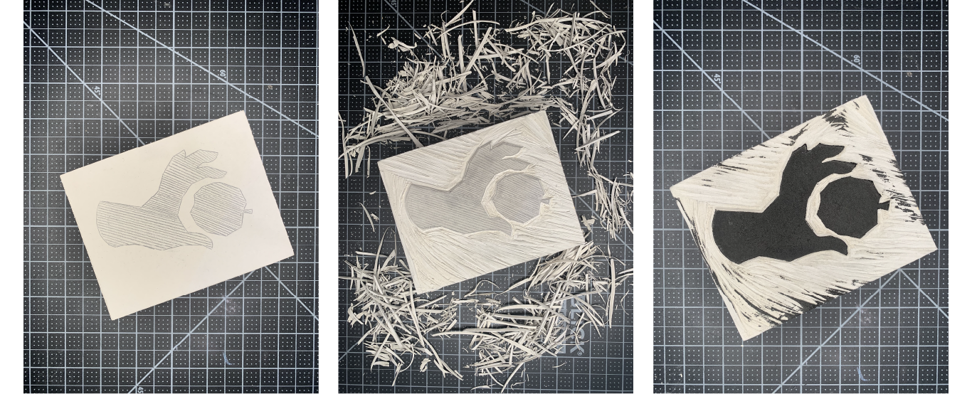
Process
A linocut logo was central to the creative vision, ensuring that the brand mark felt handcrafted and tactile. The process of cutting, inking, and stamping introduced small imperfections into the mark that reflects the messy and imperfect process of theater-making.
Like the typeface used in this project? Go give it a look...